On the Radar
See how to grow your app, evolve your marketing, what's new in the app industry and stay in the loop on updates from App Radar.
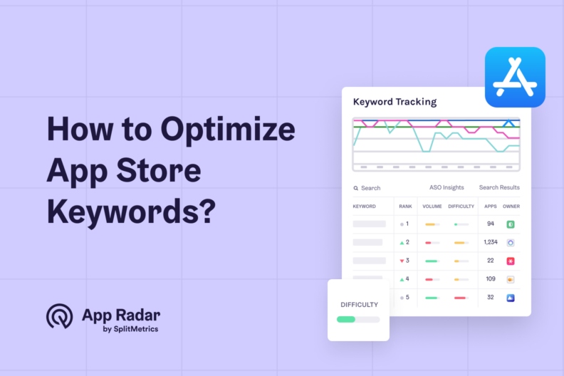
iOS App Store Optimization, App Keyword Optimization • June 30, 2025
App Store Keywords Optimization: Full Guide For iOS…
App Store keywords are specific words or phrases that make a mobile app visible in organic search results. Users discover applications by entering these search terms, making strategic keyword research and implementation essential for optimizing an iOS app’s visibility. This process is a fundamental part of app store optimization (ASO). After reading the article, you…

iOS App Store Optimization • May 19, 2025
Winning with ASO in the App Store: A complete guide to succeed with your iOS…
App store optimization (ASO) is the cornerstone of success on the App Store. It establishes organic visibility and improves conversion rates, impacting all paid user acquisition channels. Its scope broadens each year, incentivizing ASO specialists to explore more aspects of app marketing. App store optimization (ASO) for the App Store requires a unique approach. Like…
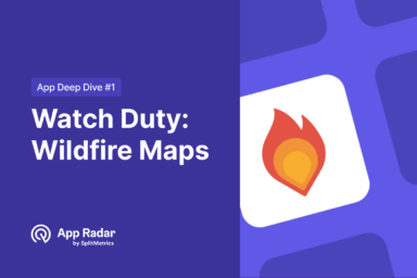
Analytics, App Growth • March 14, 2025
How Watch Duty Became the #1 Wildfire Tracking App on the App…
Watch Duty: Wildfire Maps surged to first place on the App Store’s Top Chart in January 2025 as wildfires raged across California. Its ASO strategy was clearly among all the factors that contributed to the velocity of the app’s success, making it more visible in this dire time. In a matter of days, Watch Duty:…
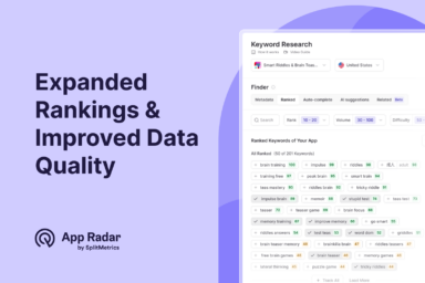
Product Announcements • February 20, 2025
Check Out App Radar’s Expanded Rankings & Improved Keyword Data…
App Radar now has more precise and reliable organic keyword metrics than ever before. Following our most recent and major updates to Keyword Research and Monitoring, we offer you a third one, expanding keyword rankings and improving data quality. This update will allow ASO managers to access deeper keyword insights, uncover hidden opportunities, and confidently…
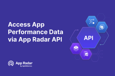
Product Announcements • February 7, 2025
Unlock App Performance Data with App Radar’s…
App Radar’s API lets you view all desired app performance and app store optimization (ASO) metrics in your chosen business intelligence and reporting software. Access App Radar’s granular Google Play and App Store data aggregated with our unique tech and easily connect it with any other analytics you need. What is the App Radar API?…
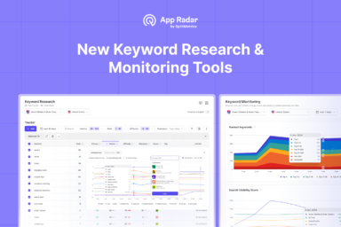
News and releases • February 6, 2025
Try Our Redesigned, AI-Driven Keyword Research & Monitoring Tools for Faster and Easier…
The complete overhaul of App Radar’s Keyword Research Tool streamlines the workflow into a single, intuitive page powered by AI-driven insights and enhanced data quality to help you boost app visibility on the App Store and Google Play. Complementing this, the revamped Keyword Monitoring Tool offers a dedicated space to track keyword rankings and visibility…
Get valuable insights
right in your inbox.
right in your inbox.
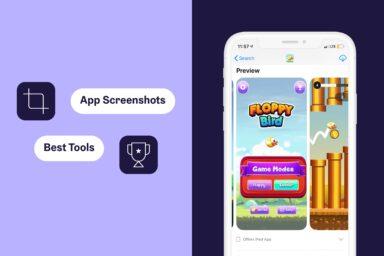
ASO • January 31, 2025
Best App Screenshot Generators: How to Create App…
App screenshots are very important in ASO. Here is the list of top 11 app screenshot generator tools to create stunning android and iPhone…
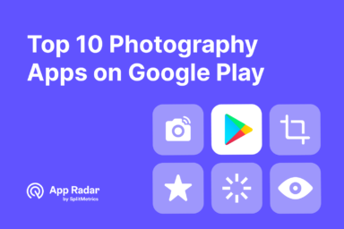
Analytics • January 30, 2025
Top 10 Most Downloaded Photography Apps on Google Play – December…
December is a standout month for photography apps, as holiday celebrations and year-end events drive users to capture, edit, and enhance their cherished memories. With millions turning to Google Play for the best tools to perfect their photos and videos, competition among apps in this category reaches its peak. While native apps like Google Photos…
Google Play Store • January 21, 2025
What Are Custom Store Listings in Google Play and How Do They…
Custom store listings are personalized Google Play Store pages that target specific user segments with unique content, visuals, and messaging. They allow developers to showcase relevant app features to different audiences based on demographics, user behavior, or acquisition channels, enhancing user engagement and conversion rates. These custom product pages are an essential when working on…
Google Play App Store Optimization • December 10, 2024
Google Play Pre-Registration: What is it and Why it Matters for…
Google Play pre-registration is a feature that allows Android developers to showcase their app or game on the marketplace before its official release, enticing users to sign up for a future download. Its primary purpose is to enhance launch success, but pre-registration benefits extend to app store optimization (ASO). The basics of Google Play pre-registration…
App Retention, Mobile app development, App Growth • November 25, 2024
Top Push Notifications Services And Tools to Engage Users [2024…
Push notifications are powerful tools for app marketers. They offer a direct line to users and can significantly boost engagement and retention. However, tons of different push notification services flood the market. This article will simplify your decision-making process, presenting a curated list of the top 11 push notification providers for 2024. Each entry includes…
ASO, App Growth • November 7, 2024
The Ultimate ASO Checklist by App Radar
The App Store Optimization (ASO) Checklist outlines essential steps to improve an app’s visibility in app stores. Key items include keyword research, optimizing the app title, description, and icon, choosing relevant categories, gathering user reviews, and tracking performance metrics. Following these steps increases downloads and boosts user engagement. We have prepared a comprehensive list of…
1 - 12 of 139 posts