In this article we are going to see the different required sizes of app icons for App Store (iOS iPhone / iPad) and Google Play (Android), some tips to improve them and some makers / generators to design them easily.
The icon of an app is one of the first elements that users see in the stores, and thus, are paying attention to. Nowadays, people tend to be much more attracted to visuals than to texts, descriptions, and explanations. With time, we are getting more and more lazy and what we all want is to have simple access to information.
![]()
For these reasons, it is more than important that you optimize the listing’s visuals on Google Play and App Store, and most of all, the app icon. Anyway, please, don’t forget about screenshots and videos. Icon optimization is crucial in any App Store Optimization strategy, as the icon has a HUGE impact on both visibility and conversion rate.
Table of Contents
App icons sizes for iOS and Android apps
First, you need to know what needs to be the size of the icon for each store. Right below, find the official guidelines & specifications from the Google Play Store & from the Apple App Store.
Google Play Store
- Final size: 512 px × 512 px
- Format: PNG, 32 bits
- Color space: sRGB
- Max file size: 1024 KB
Apple App Store (iOS)
- iPhone: 180px × 180px (60pt × 60pt @3x), 120px × 120px (60pt × 60pt @2x)
- iPad Pro: 167px × 167px (83.5pt × 83.5pt @2x)
- iPad, iPad mini: 152px × 152px (76pt × 76pt @2x)
- App Store: 1024px × 1024px (1024pt × 1024pt @1x)
Now that you have all the sizes on hand… Time to start creating.
You could be interested | App Store screenshot sizes guidelines
17 Tips to create the best icon for your app or game
You want to make a good first impression. And even more on the users that are browsing the stores, without knowing exactly what they want. These are the ones you can convince by having a great icon. But how can you do so? There are different strategies you can follow to improve app icons and make them awesome. In this article, we’re sharing 17 tips you can follow to make your icon tremendous and to make the conversion rate to visit (traffic) and to download take off. 🚀
1. Make the icon clear & simple
One of the first things you have to take into account when creating your icon is that it needs to be clear and relatively simple. By simple, I mean that it should be easily understandable by users. As we mentioned earlier, they want to have quick access to information to make quick decisions, so the more clear and simple it is, the better.
2. Stick to your brand visual guidelines
It might seem obvious, but it is quite important that you keep your brand design in mind when you’re working on your icon. It should follow the same guidelines and convey your brand image. At first sight, the user should know that it is yours and recognize your brand in the app icon design. This tip goes for your icon and for every visual asset of the listing – there should be unity within all of them for the listing to be coherent.
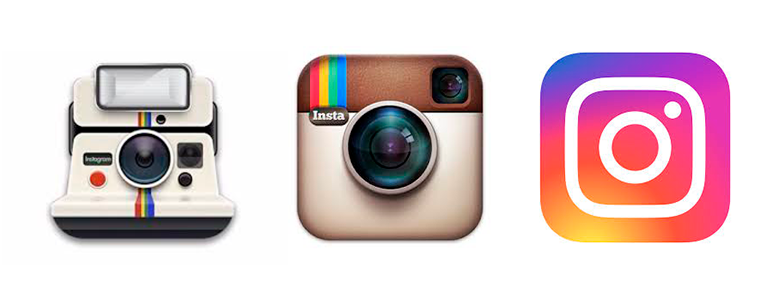
3. Don’t necessarily use the logo
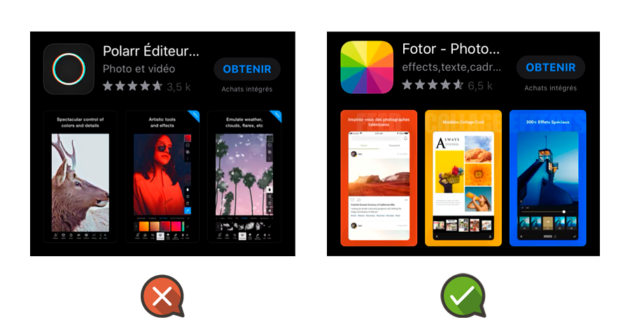
It can be easy to get mixed up, but in most of the cases, the icon of an application should not be the logo of the brand. Huge brands and multinationals like Twitter, Nike or H&M, are using their logo as their app icon, and this is understandable as they are so renowned that their logo speaks for themselves. However, other apps should not limit themselves to just putting their logo there but should work on a compelling and attractive icon to make the best first impression possible and catch users’ attention.
4. Add borders in the icon
We recommend using borders in the icon. Borders make the icon stand out and much more visible to the user’s sight when searching or browsing the stores.
5. Think about the background
With the new iOS 13, users can now choose if they prefer to have a clear or dark background to their phone, and thus to their app store. The dark mode is also available on Android (read more here). It is important to take it into consideration when creating / updating the icon.
Indeed, when the background could only be white, you only needed to make sure that the icon stands out on a single background. Now that users can choose between a clear and a dark background, you need to make sure that the icon stands out on every background. A very dark icon could go unnoticed on a dark background, so you could go for bright colors, adapted to both backgrounds.
6. Don’t use text (or do it!)
You should not add text to the app store icon. It will reduce its readability and make it hard to understand. The text would be so small that you could not read it, which means that the users most likely would not get what the application is about. You should rather explain it with visual elements, easier to understand at first sight.
But… Sometimes, including the YEAR or the word “NEW” in the icon works well…
7. Check on the colors used for the industry / niche
Have a look at what is usually used by competitors for their own app and check which color is usually used for your industry or niche. Get informed about what different colors convey to the users to find out which would work best. Go for the ones that represent best the essence and the functions of your app.
For example, in the Productivity category, a big majority of the app icons are made with blue, a color that is known to stimulate productivity.
8. A/B testing is your best friend
This tip is a must for every ASO strategy. To know what to go for and what will work best in terms of Traffic and Conversion Rate to Download, you should proceed to A / B testing. It allows you to try different icons within the same listing on the stores and find out the one that brings the most organic downloads. For Google Play Store, you can use Google Play Console proper A / B testing tool to do so. For the Apple App Store, you will have to use an A / B testing tool such as Splitmetrics, StoreMaven, etc.
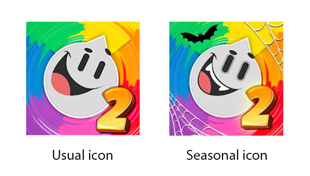
9. Work with seasonality
You can work on seasonality and update your icon for festive seasons or special events such as Christmas, Halloween, Black Friday, etc. To do so, adapt the colors of the icon, or add a distinctive element on one of the corners to make the icon stand out and to show that your app is up to date.
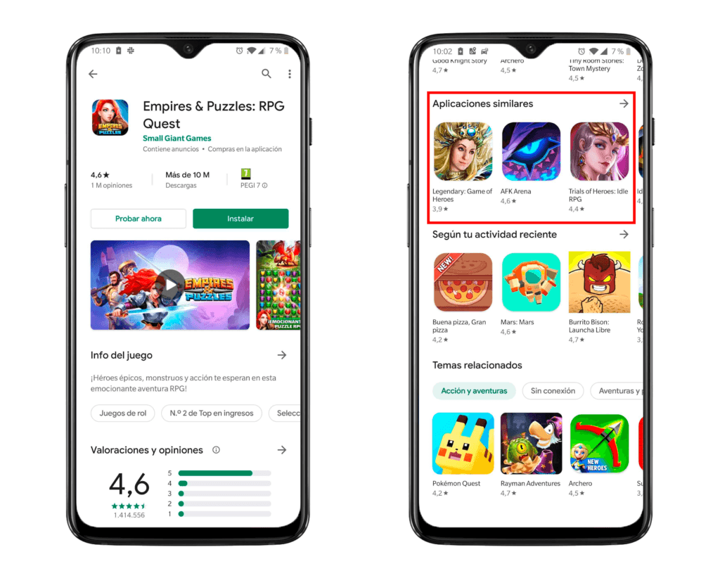
10. Focus on Similar Apps (Google Play only)
A strategy that you could decide to go for is to study your competitors and decide to develop a very similar icon to try and appear in their Similar Apps Cards on the Google Play Store. Indeed, we noticed that referring apps (apps that link to any app in the Similar Apps Cards) usually have a very similar icon. Work on a very similar icon (shapes, colors, elements…) as your competitors leading the market and try to appear in their Similar Apps Cards – this will make your app / game gain a lot of visibility and traffic / downloads on Google Play.
11. Differentiate yourself
Yes, this is basically the contrary to our last tip. This is actually another strategy that you could decide to opt for. You could choose to work on a very different icon to stand out from the crowd of similar ones out there on your market and try to catch users’ attention by being different. We recommend you try both options (think about A / B testing there ;)) and to see what works best for your app / game and brings you the most visibility & downloads.
12. Make it scalable
The app icon size should be scalable, which means that it should always look good, whatever its size. Work on an icon that is visible and understandable even in a very small or big size so that however it is displayed, users can understand what it is about and the quality remains good.
13. Don’t overload the App Icon
This tip goes along with the “make it clear” tip. Don’t overload your icon and put tons of content there. Try to add only the necessary and not to make the end result too busy. It would make it hard and require too much effort for the users to understand what it is about, and we know that we need to catch their attention immediately to have a chance that they click to visit the listing.
For example, if you add too many elements to the icon, maybe Google Play is not understanding the topic or topics the app / game is about… And this is not good.
14. Make the icon recognizable
Try and find a unique element to your app icon, customize it and make it recognizable from other ones. This way, users will immediately know when they come across your application and recognize it at first sight.
15. Make it platform-specific
Adapt your icon for each store the app / game is listed in. Indeed, Google Play Store and Apple App Store (& also AppGallery from Huawei, Amazon App Store…) have different requirements and platform standards. Work on a specific iOS app icon, a specific Android icon, etc. and make it perfect for each store your app is present in.
16. Update the icon regularly
Don’t forget to regularly update your icon, always be informed on trends and news to adapt it to the current looks. Don’t be afraid to try new things – this is how you’ll find out what works.
17. Avoid transparency
Finally, try not to use transparency within the icon. As we mentioned earlier, there are now different backgrounds available on the App Store and having part of the icon transparent could make it completely unreadable. We recommend you not to make any part transparent not to risk having this kind of issue. The App Store itself does not recommend to do so.
App icons makers & generators
To make it even simpler, we’re sharing with you the best tools we know to create amazing icons.
- Canva: create and design the app icon from scratch for free.
- Iconsflow: create an icon design for free.
- Appicon.co: drop a file here and generate the app icon in all the sizes you need for iOS & Android devices.
- Appiconmaker.co: drop a file here and generate the app icon in all the sizes you need for iOS & Android devices.
- EasyAppIcon: generate the icon + preview of how it will look like on iOS & Android devices.
Conclusions
In the end, there are a lot of different strategies you could decide to opt for, and the app icon can fully be adapted to any app / game for each store. If we had to sum up, here’s what we think is the most important to remember when creating an icon:
- Keep an eye on the competition + trends to know what’s happening on the market
- Make it clear & understandable
- Don’t be afraid to try, test, update, and learn
This is by trying different things that you will find out what’s the most effective, so… Have fun and keep on ASO!

5 thoughts on “App Icon: Sizes, Tools to Create It and 17 Tips to Improve It [iOS + Android]”
Thanks for your article!
The app icon is very interesting. I love it so much.
We’re glad you like it! 😄
Thanks for the article.
Just pointing out that you’ve attached Google Play Official links for both Apple & Google ‘Read Official Information’ links.
Hi Toby,
Thanks for pointing it out, we’ve just updated the link for Apple official information, you can find the correct one now. 🙂
what app can i use to make the icon